
How can improving usability increase feature usage?
Turning a page with low usage into a seamless User Experience for a Web3-based SaaS startup.
FEB 2022 - MAY 2022
RESEARCH - USABILITY TESTING - UI - WIREFRAMING
MY ROLE
I have been the sole UX/UI designer for this company for over a year, working in close partnership with the Product Owner and Engineers. I was responsible for all processes presented in this project, including research, usability testing, UI and handoff.
THE CLIENT
Farmer Connect is a global agri-tech SaaS startup focused on providing a Web3-based solution that enables transparency throughout a commodity's (such as coffee and cacao) supply chain, and at the same time empowering farmers and supporting sustainability programs.
THE PROJECT
The company's clients use a back-office platform to first input a heavy amount of data which forms the product tracking system. Then, they can register and assemble their product page for Farmer Connect's consumer-facing website, ThankMyFarmer. The clients will print QR codes on their product's packaging, which when scanned, will lead to the product's page on the TMF website. This takes the transparency in the supply chain directly to the final consumer.
Problems to be solved: why are we redesigning?
1. Bad usability
The then-current version of ThankMyFarmer.com had never been tested for usability, neither pre nor post-development. To get feedback, we used Maze to test the map feature that was currently in production to find out if there were any usability issues we should be fixing.
The convincing argument for improving the UI and UX of the website was simple - it is already well-known that a good UI can improve conversion rates up to 200%, and good UX overall, up to 400%.
These were the findings:

👉 Users are unable to identify the carousel and therefore go through the journey.
👉 The coffee Origin, represented by the beans with flags, was not clear to users.
2. Bad responsivity
Users also had very little space to view the map on small screens, especially on desktops. The way the scroll worked on mobile also added problems, as people would try to scroll down the page and accidentally end up scrolling down the map and vice-versa.
👉 With more than 80% of all accesses to ThankMyFarmer's tracing pages being done from a mobile device by scannig a QR code on coffee packages, the responsivity becomes an essential element to be considered for the success of the product.

3. New business needs
As the product evolved and new clients came on board, new business needs came up, and the current design was not able to accommodate them.
👉 Customers like the results and want more: our customers want to add more information on each card, such as the names of each location, photos and videos. They already have all these visual resources and they want to surface them using our platform.
👉 New clients coming on board requiring more complex forms of tracing - these new clients owned bigger products with much more complex traces, including multiple origins and multiple linking points, which were not supported by our current design. To not lose these clients, we would need to adapt.

Benchmarking
I have looked for other players that used maps with multiple locations pinned or carousels. For each player, I have analysed the positive and negative aspects, and the possible issues or unanswered scenarios.
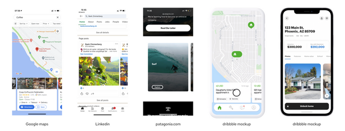
Overall, the one reference I was able to gather with equally complex cards was Google Maps, but their experience doesn't follow one specific path. From this benchmarking, we realised we might not be able to continue using the carousel as the main mechanism to navigate the journey, as any reference we could find would either use carousels without a specific story order or not use them at all.
👉 View the complete Benchmark analysis.
Alternative generation
Since I already knew that the carousel would not be fit for complex traces (multiple origins and/or stopping at the same location at different times) but we assumed that the carousel was the most interesting experience, I have decided to design two different versions for the new map experience. The first would keep the carousel as a way to show a continuous journey, and another would use independent pins.
To solve the main usability problems from the previous map version, I moved the carousel and the interactive map to a drawer, making it impossible for people to accidentally scroll the map while trying to scroll the page or the opposite.
The alternative generation process involved several feedback sessions with the stakeholders. The feedback was used mainly to update copywriting and icon styling, finally landing on the following designs to be tested.

Usability testing
One prototype was created for each solution (carousel or pins), alongside tasks to be completed by the users. I wanted to understand three problems:
👉 Can users find the map on the product page and understand that they can interact with it?
👉 Can users understand how the map/pins work?
👉 Can users understand the information shown on the cards?
Each of these goals justifies all tasks given to users and questions asked.
Users were recruited for the test Guerrilla style, recruiting people working in the same office building from different areas, ages and genders. Each user was only able to test one solution (pins or carousel). The tests were done online through Google Meet.
.png)
👉 See recruiting data
👉 See the complete test script
Test result analysis
Follow the result analysis for each problem and each task given.
1. Can users find the map on the product page and understand that they can interact with it?
✅ Yes!
A few users tried to tap the map before tapping the "explore" button. This issue can be easily fixed by making the whole map image clickable on the product page.
2. Can users understand how the carousel/pins work?
✅ Yes!
The usability problems with the carousel were fixed in the new version.
3. Can users understand the information shown on the cards?
🚨 No.
For the order of the flow, we will have to change the green arrow shown on the map to make it more visible. The icons for each facility do not state clearly what they mean, but there is no easy way to explain what each location is using an icon.
4. Can users understand the "See story" feature?
👀 Kind of...
The "See story" button may not be clear as users tried to tap the full card, but all of them found it afert a couple of taps. Can be easily fixed by making the whole card clickable.
Conclusion
Overall, we can say that the test was very successful. Alongside the development team, I was able to find solutions for the main issues found in the previous version (carousel usability, how to tackle complex traces, how to add more information to each location) successfully and map simple solutions for all other problems, except the difficulty of understanding what was the origin.
In terms of priority, I have recommended to the team to first create the Pin version, as it works for both simple and complex traces. The idea that the carousel is more interesting is an assumption, so there is no justification for the effort of releasing both alternatives without that being a certainty.
Results
✅ Successfully secured new clients
Three new clients were signed thanks to the updated capabilities of the new map.
✅ Improved responsivity and usability
This was clear through the usability test results.
✅ Increased company's UX Maturity
Starting a testing culture can be difficult, but the results of the original usability test and the improved version were astonishing to internal stakeholders, showing the value of improving UX throughout the company.
🤔 Increased time spent on page?
This was the metric intended to be used to successfully validate if the initial goal of the redesign was reached. Unfortunately, I left the company while the development team was implementing the new map, so I couldn't get results.
Check out the mockups presented to internal stakeholders and a prototype below!
Click on the images to expand.


Final prototype
Unfortunately, thankmyfarmer.com has been discontinued as the company changed its strategies, but you can see the recorded prototype of the final solution for this feature. Click on the video to start and enjoy!
